
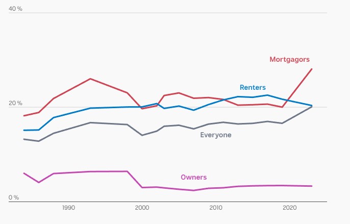
If it feels like we’re in uncharted territory when it comes to keeping a roof over your head, you’re right.
Housing costs are the highest on record, and a closer look reveals who is being hit hard and who is unscathed.
Visit this interactive visualisation from Story Lab on abc.net.au.
